

Telestrations
A tabletop game, boasting world wide recognition and 10+ million copies sold since it's launch 15 years ago, comes with a lot of expectations while undergoing a rebrand.
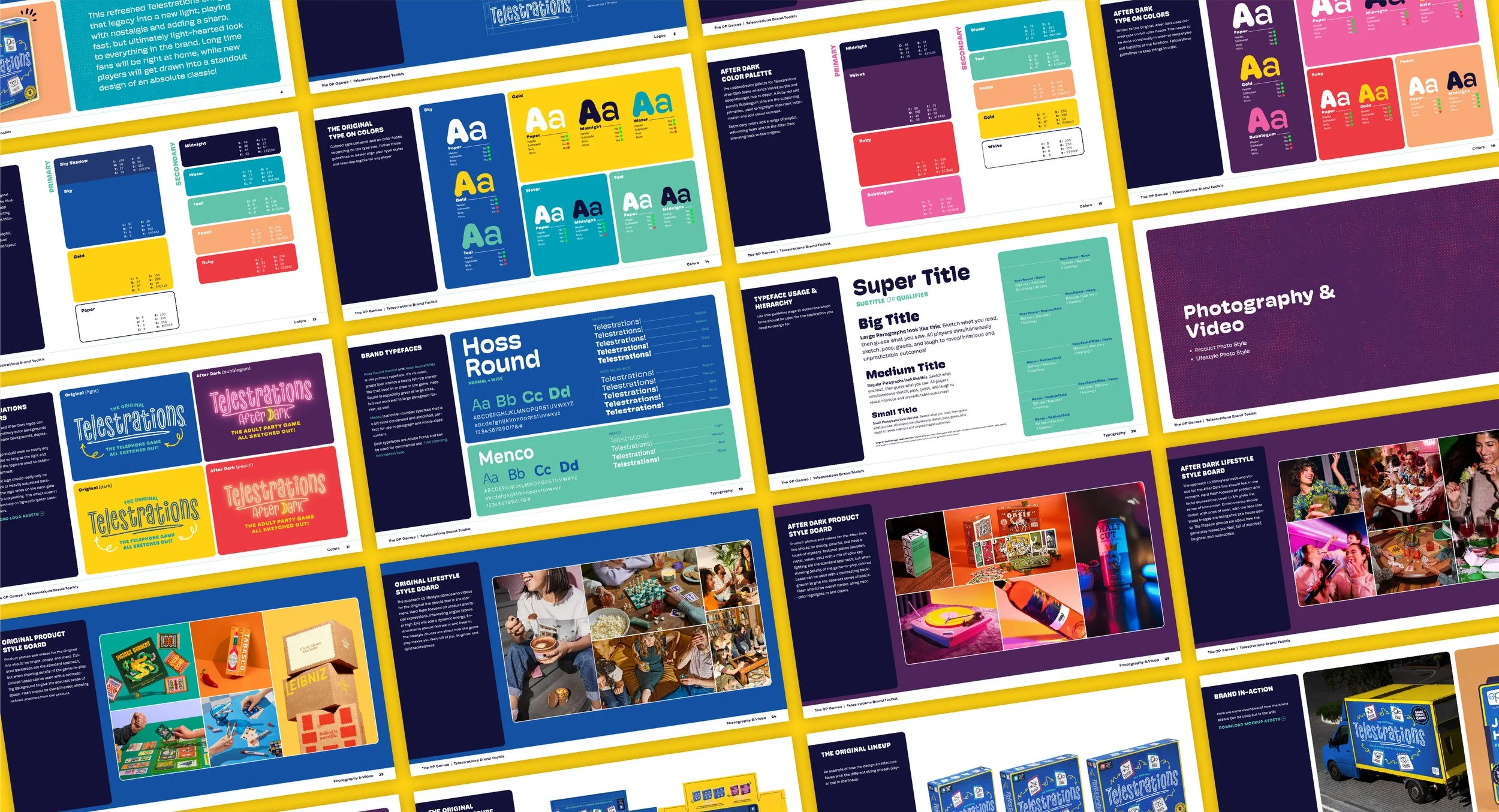
The OP was looking to pay homage to the original Telestrations while holistically evolving the beloved property for the next era, helping it compete in the market of hot, new tabletop games.
Client: OP Games
Client Lead: David Blanchard
Rethinking the sketch
Many game's brand and packaging design, understandably so, hinges on elements of gameplay. Frequently, the most literal visualization is what makes it to print. With a brand as big and well established as Telestrations, there was more room to nod to the gameplay steps, without being so literal, bringing the gameplay loop to life through playful illustrations.

Details brought together
Every detail plays with the imperfections of a felt-tipped marker, with no straight lines or square corners. Elements are soft and loose, while adhering to a simple, yet organized structure for strong readability on shelf.


Beyond the Package
The new brand language is built with enough energy and flexibility to work across a variety of different promotional materials in major markets throughout the world.


Great Partners
“We collaborated on an IP refresh that many people here hold passionate opinions about and could have been a mess. However, I couldn’t be happier with how we came together and threaded that needle, presenting a fresh look at a classic brand and really making these games shine.
It’s been an absolute pleasure working with you and we couldn’t be happier with the final product."
— David Blanchard - Director, The Op Games
